
Empathize
I’ve led a project that had been stalling for over 18 months due to the absence of a clear vision and strategy. The comps below are a part of the “Organizational Process Assets” I’ve reviewed to get started.


Define
After reviewing previous documentations, I’ve met with key stakeholders individually to gather each of their business requirements and gained insights to the current friction points. At which point, I’ve clearly documented project goals, objectives and restrictions. I’ve begun a few deliverables that lead to a more complete, clear picture of project vision and strategy.
Problems Found
No existing design direction between desktop and mobile
No approved content or UX strategy
Integral stakeholder feedback not addressed
Disjointed Desktop and Mobile patterns
Unclear messaging and positioning because of lack of defined Personas
Not utilizing the latest UI patterns
No decisions based on competitive analysis
Restrictions Established
Color palette is limited to the existing palette because of the already produced presentations and collaterals
Limited to existing assets for case studies with no new production, that could only be manipulated with code
Activities I have initiated:
Target Audience - explores the most important customers and becomes a part of the Functional Specifications and UX Strategy as "Personas"
Competitive Landscape document summaries the best practices for UX and content strategy. I’ve created a spreadsheet matrix with a dozen direct competitors that measures against UX and Content Strategy summary (a lot of content VS minimalist content), Navigational Paradigms (burger VS no burger menu), responsive, so on and so forth...
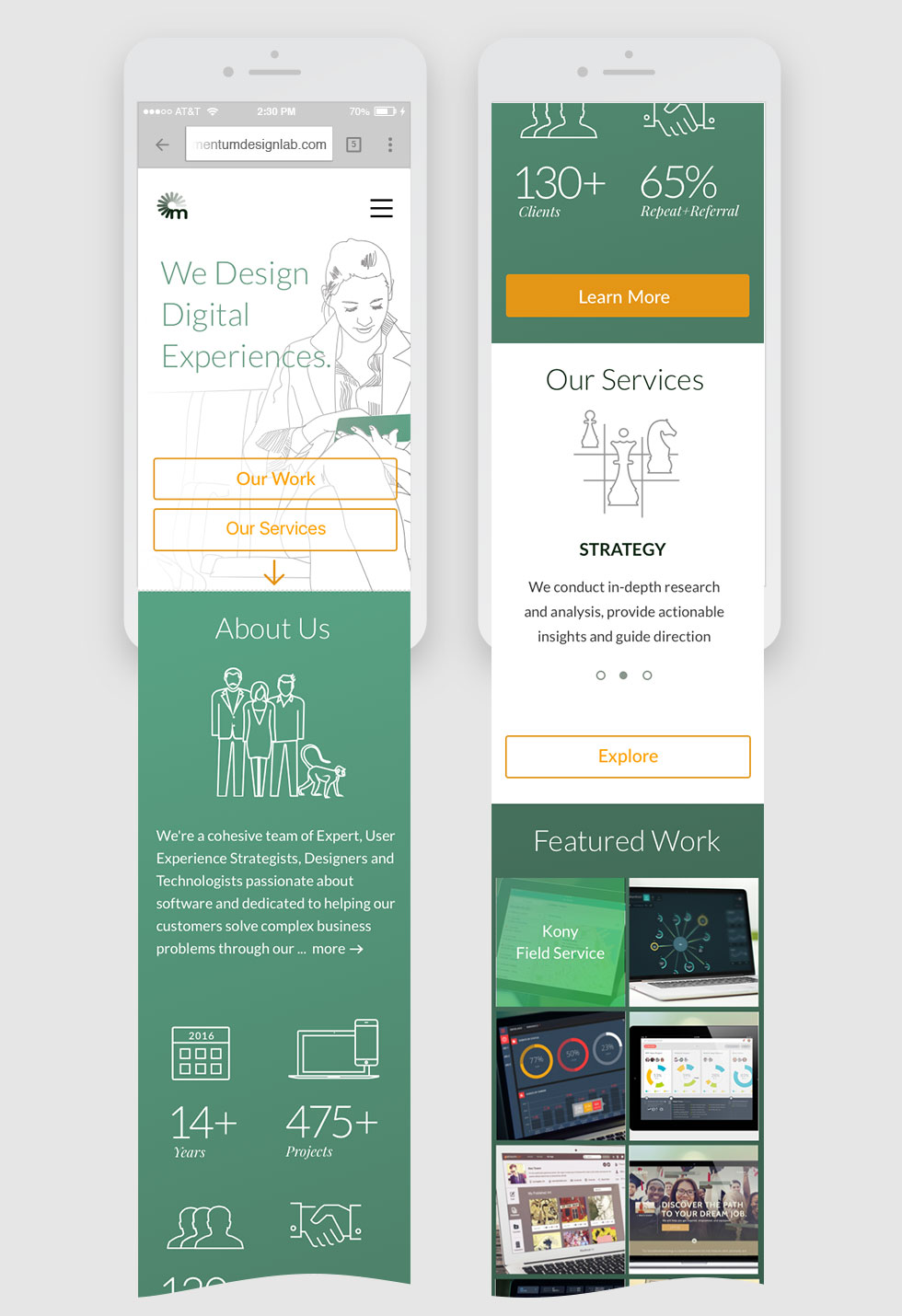
Technical Restrictions document was developed around existing portfolio assets. The layouts below illustrate my concepts on project hero area: a hero single image composed of two images cropped in a dynamically via code
Project brief defines the scope such as project approach, milestones and deliverables
The comps below are a part of the portfolio hero treatment explorations.


Structure
After the project was defined from a UX, technical and target audience perspective, I’ve created several options for organizing content. My strategy was not to force anyone to choose one system, but rather open up for a conversation on UX strategy. My goal was to reach a consensus after stakeholders have interacted with the user flow prototypes. Below are the 3 out of 9 sitemaps we’ve collaborated on.


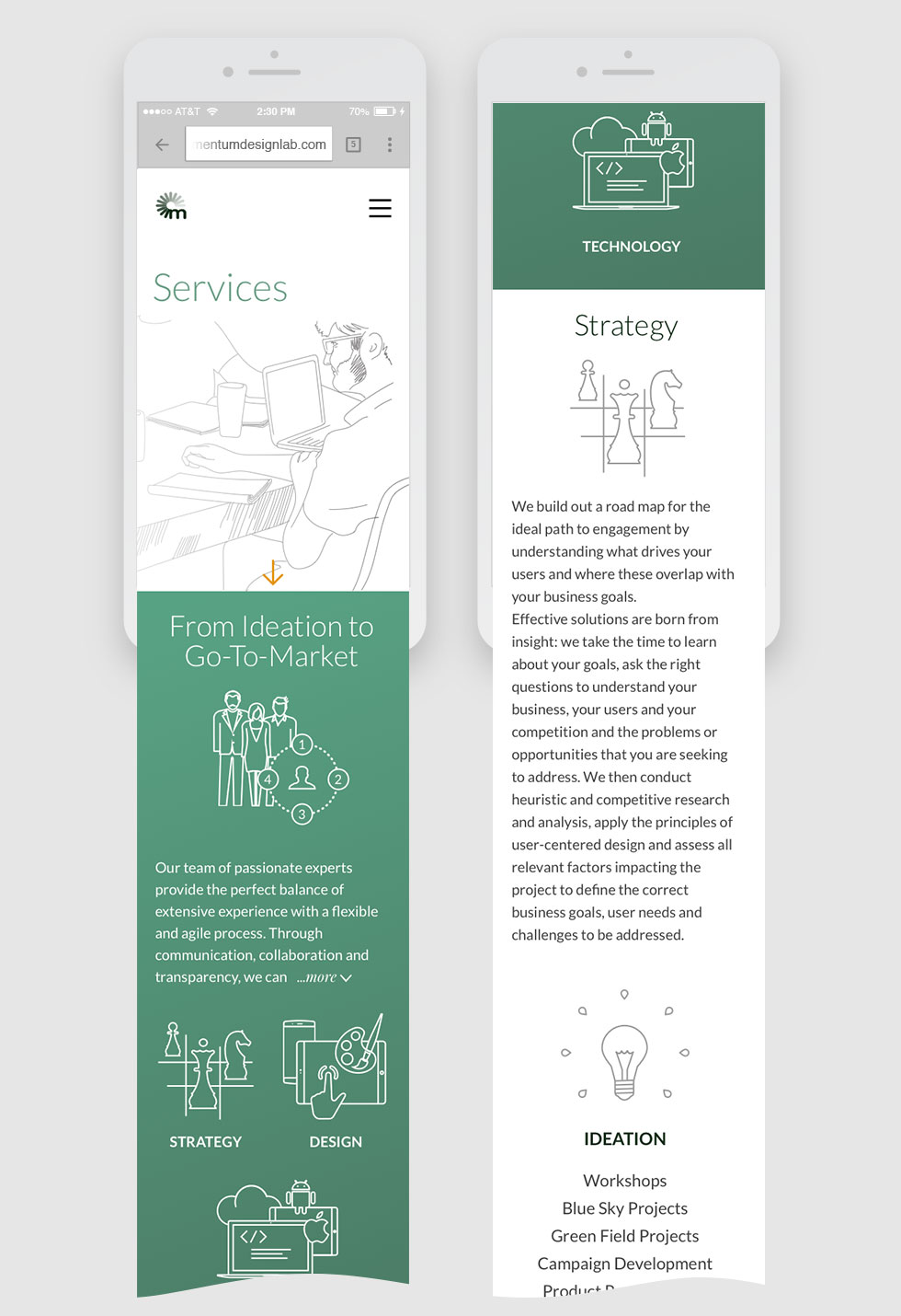
To further validate the content strategy, we’ve explored four wireframe concepts which we’ve narrowed down to a final concept. Here are some sample wireframes that were prototyped and tested using InVision.


Design
Moodboards
We’ve created moodboards by researching for inspirational design and interaction samples which include:
Homepage hero designs
Responsive site patterns
Illustration styles
Navigation UI
Typography
Iconography


Visual design directions
Next, informed by the brief, wireframes, moodboards, we went on to create Visual Design directions. Below are two initial directions that were chosen to be explored. These were chosen because the stakeholders looked for:
Alternative solutions for the hero space using no photos
Styled and non-generic icons
Clean typography
Simple and minimalistic patterns
Restrained use of color palette, with minimal changes to existing palette


User Testing
Here are sample prototype screens we’ve used to gather key insights:
Tested stakeholders’ suggestions to add a floating subpage navigation for desktop and tablet, which we’ve found does not add any value
Considered adding a blog content filter, but we’ve learned it's superfluous
Realizing we need to explore a different pattern for rotating content, we’ve suggested adding an arrow to the top hero space to better engage the users
To optimize for a responsive site, we’ve established a better copy content strategy that accommodates small screen devices
Similarly, we’ve streamlined design elements to accommodate the responsive screen breakpoints