
How We Turn Ideas into Impact
Here’s an inside look at the process I use to turn ideas into outcomes-grounded in Lean UX, focused on impact, and always collaborative.
You heard of Design Thinking framework which I find great during ideation, but I’ve come to prefer the Lean UX principles for software development as these principles provide a backbone for an overall process by focusing on "outcomes" vs the usual gravitation towards “outputs” or deliverables.
However, Lean UX is a mindset shift for the larger product team. Here below I break down how I use this Process and show outcomes of this process.
The Process at a Glance
This is essentially the cycle of the process at play. “Think” stage - contains working on Assumptions and turning those into Hypothesis statements to build and test. Once we prioritize the Hypotheses we move on to the next stage. “Make” is a stage where we design and build the necessary pieces to test our hypotheses. “Check” is a testing stage where we get feedback from the users on all of the hypotheses we choose for a particular stage.

“THINK” STAGE
Most software creation processes focus on features and deliverables. Often, the strategic context for those requirements is absent or not communicated. Lean UX refocuses us on strategic context as well as how we as a multidisciplinary team define success. “Our goal is not to create a deliverable or a feature: it’s to positively affect customer behavior or change in the world - to create an outcome.”
Assumptions VS Requirements
For effective outcomes, Lean UX shifts away from requirements to assumptions that lead to a hypothesis. Language change is key as we interpret the word "requirements" as facts, whereas assumptions presuppose we may be wrong.
Since "assumptions" are our beliefs based on expectations from the user or a process, we're in alignment to validate these assumptions before building products and we’ll use Lean UX Canvas to fill in our assumptions in four main categories:
Business outcomes
Users
User outcomes
Features
Lean UX Canvas
This is essentially the backbone of Lean UX, which provides us a structure for a team exercise exploring and answering these sections together. Usually, I try to introduce this during discovery sessions to get things started.
|
Problem Statement 1 |
Solutions 5 |
Business Outcomes 2 |
|
Users 3 |
User Outcomes & Benefits 4 |
|
|
Hypotheses Combine 2, 3, 4 + 5 6 |
What's the most important thing we need to learn first? 7 |
What's the least amount of work we need to do to learn the next most important thing? 8 |
1. Problem Statement
The first step is we as a multidisciplinary team, outline the problem we’re solving. Why are we starting on this product, feature, or whatever it is? What is the market opportunity? How will the product address this market opportunity? This creates the focus and also guardrails that are necessary, as “creativity thrives in the constraints ”.
2. Business Outcomes
AARRR Pirate metrics: acquisition, activation, retention, revenue, referral. Measures of success. What is the definition of “done”? How do you know your product is successful?
3. Users
The people we’re creating the product for. Who are they? Here we construct Personas to understand who we’re aiming the product for.
Start with Persona types
Complete Proto-personas with behavioral, demographic, and psychographic characteristics; and “pains and gains” or goals and obstacles.
4. User Outcomes & Benefits
This is what the users want from the product. What are their pain points? How can the product solve them? What benefit do they get? What goal do they achieve?
5. Solutions
This is the Output. How do we improve or what do we need to create in our product to give the users the desired outcome? Features, initiatives, programs, etc


6. Hypotheses
Next, we proceed to formulate hypotheses. This requires us to transform our assumptions into clear statements that can be tested. It’s typically recommended to start with Feature hypotheses and engage the team in a collaborative exercise to kick off this process.
Feature Hypotheses
“We believe that [biz outcome] will be achieved if [user] attains [benefit] with [feature].”
|
We believe that: |
|||
|
We will achieve |
…if the user… |
…can achieve… |
…with this feature |
|
[biz outcome] |
[persona] |
[user outcome] |
[feature] |
|
An easy and intuitive accounts default screen |
Any end user Persona |
finding all of their accounts with quick links to viewing statements as well as making a payment. |
Home Accounts tab (default) |
Hypothesis Statement
|
We believe that: |
|||
|
We will achieve a simple and intuitive default screen for the accounts tab by prioritizing the display of the most relevant content and links on the Home account default tab. That content includes all of the accounts, “cardless cash”, make a payment CTA, view statements CTA, settings icon, and search |
|||
|
Our initial success criteria for this screen is that at least 80% of beta testers can locate all account-specific information they need within the first 15 seconds of a usability study. |
|||
Hypothesis Prioritization Canvas
Once we have hypotheses, we need to prioritize them to understand what needs to be tested first, what can be built, and what possibly doesn’t need testing.

7. What’s the most important thing
we need to learn first?
Once we choose the hypothesis, we want to establish what are the technical risks, marketing risks, design risks, business risks, and brand risks to this hypothesis. The task however is to highlight the most important risk that could break up the hypothesis from here.
8. What’s the least amount of work we need to do to learn the next most important thing?
Whatever we chose in the previous step - needs to be tested, but what would be the least effort?
“MAKE” STAGE
A stage where we either draft, design, or otherwise build with the focus on testing our hypothesis in so-called Learning Loops.
This phase is a four-step:
Initially, we focus on creating the use cases /scenarios
Then we create screens and flows to represent a hypothesis
Then we use a priority matrix to choose what to test and build first.
Build prototypes with a focus on MVP
Typical artifacts for various stages:
Early stage
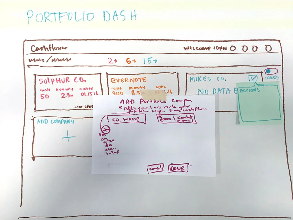
Wireframes - low to medium-fidelity screens representing the created hypotheses.
Flows - sequence of screens to show how a user goes from A to Z.
Prototypes - low to medium-fidelity click-through flows for user testing.
Middle stage
Wireframes - medium fidelity screens and flows of the product or feature.
Mockups - high fidelity screens in later stages of the design ready for development.
Prototypes - low to high-fidelity click-through flows for user testing.
Design System organizing components and elements.
After the Launch stage
Wireframes - create new functionality/features
Mockups - create high-fidelity screens in the final stages of the design.
After we have tested non-coded prototypes we test functioning application environments.
During initial or post-launch, we experiment with A/B testing and create alternate screens to test which performs best.
Updates and improvements to Design Systems.


“CHECK” STAGE
While User Research is discussed in most design processes, Lean UX puts a special emphasis on testing with users early and often - with a concept called GOOB, intended to remind us that it is critical to "get out" and validate our hypothesis VS keep building relying on internal stakeholder feedback.
Lean UX also identifies a safe space for failure as an important ingredient in the process. Innovation cannot happen where experimentation doesn’t take place - and experiments are loaded with failure on the path to success or course correction.
This phase is a three-step:
Find participants for the research study (decide on methodology, etc)
Create a UX research study plan that includes:
Project background
Research goals
Research questions
KPIs
Methodology
Participants
Script
Test and learn throughout the length of the whole design and development process.
A couple of critical aspects to highlight:
The testing and research should be continuous throughout the process.
Reframe failure as crucial data to improve the product and communicate the potential of course correction.
Break down user interactions to focus users on just a couple of important interactions per test.
Look to incentivize the commitment in users to create a good base and to test often.
In a challenging enterprise environment look for users as close as possible to generated Personas if those are unavailable - but make sure the created personas are not unrealistic or idealized.